Creating a brand identity for a small business from scratch is a difficult yet incredibly rewarding endeavor that can yield a wealth of benefits in the long run. For most small business owners, branding is just a logo. So they pay some $10 for a quick design, get a few flyers printed and then that’s it.
Then they ask themselves why customers don’t take them seriously. And this is why some people argue about their prices. Why a competitor who offers a similar product is able to charge more and retain more clients without putting in as much effort to do so.
The difference is not the product but the branding.
A logo is a part of a larger story. Brand identity is the sum of all your customer’s perceptions, sensations and ideas when they come across your company. It’s the way people can instantly identify you, easily trust you, and keep coming back to you more often than other people that also have the same things.
This guide takes you through the process of creating that identity from scratch, even if you don’t have a logo or anything else but a business name and an idea.
What Is Brand Identity and Why is It Important
Brand identity is a set of visual and verbal components that are consistently applied across each and every touchpoint of your business. That’s your logo (and colours, fonts, tone of voice, packaging, business card, social media presence, and more) that a customer sees before they choose to do business with you.
Imagine this. The moment that you step into a shop and everything looks like it belongs together, it is clean and it’s like it was meant that way – you automatically assume that the business is professional, and the product is worth the money. If everything seems like it’s a mismatch, you hesitate. You doubt of quality. The price is negotiable.
Your brand identity is making that first argument for you before you say a single word.
In Nigeria and Africa, one of the most effective and cost-efficient competitive advantages that small businesses can possess is a powerful and compelling brand. Not having a large budget is not a reason to not look professional. There must be a clear system and the discipline to stick to it.
Step 1 — Define What Your Business Stands For
Your business begins with a vision.The vision is the foundation for your business.
You can’t design anything until you have three things settled:
1. To whom are you serving?
Write a detailed description of your ‘ideal’ customer. Where do they live? What do they do? What do they spend their cash on? When they discover you, what issue are they attempting to solve?
2. How do you change things up?
What makes you the best of 10 businesses that sell the same product or service? Your response to this question is the message that you’ll build your brand around.
3. What is the desired outcome for others’ feelings?
What is the feeling your brand will leave with the person you engage? Confident? Excited? Safe? Premium? All of your design decisions should be based on this.
Record your answers on paper before proceeding on to the next step. The businesses that don’t do this end up with a great looking brand that doesn’t convey any meaning.
Step 2 — Choose Your Business Name Carefully
If you don’t have a name yet, this is a serious consideration. Your business name is one of the initial brand decisions you make, and one of the most difficult to make later on.
A good business name is:
Easy phonetically (for the speaker)
- Easy to spell correctly the first time
Hears and remembers a song on one listening - Provided in the form of a domain name and social media
- Not too specific in an attempt not to limit future growth
Don’t go with a name that is too similar to other businesses in your industry. If you intend to expand beyond your own community, refrain from names that are only understandable if your own language. And stay away from descriptive names — they’re not as memorable and difficult names to brand.
After getting your name, check the search engine and make sure your domain name is available, and even check social media handles before you’re committed.
Step 3 — Design Your Logo
Your logo is an integral part of your brand identity but it is not the most important one. If they have good colors, typography and used consistently, a bad logo will do better than a beautiful one not used consistently.
However, your logo should be executed properly.
The definition of a good Logo:
What makes a good logo:
- Simple enough to work at any size, from a business card to a billboard
- Distinctive enough to stand alone without the business name explaining it
- Appropriate for your industry and target audience
- Works in black and white as well as colour
- Designed as a vector file so it never loses quality when scaled
The most common types include:
| Logo Type | Example | Best For |
|---|---|---|
| Wordmark | Your business name styled as the logo | Strong, distinctive business names |
| Lettermark | Initials only | Long business names |
| Icon Mark | A symbol or graphic | Businesses planning long-term brand building |
| Combination Mark | Icon plus name | Most small businesses starting out |
Most small business will want a combination mark as the safest choice. It works immediately since the name is visible, and overtime the icon is recognizable without the name.
Step 4: Select Your Brand Colors
Color is one of the best branding media. Research consistently shows that color increases brand recognition by up to 80 percent. Colors you select communicate your brand personality long before you’ve read a word.
| Colour | What It Communicates |
|---|---|
| Red | Energy, passion, urgency, boldness |
| Blue | Trust, professionalism, calm, reliability |
| Green | Nature, health, growth, freshness |
| Yellow | Optimism, warmth, creativity, attention |
| Black | Luxury, sophistication, authority |
| White | Cleanliness, simplicity, purity |
| Orange | Friendliness, enthusiasm, affordability |
| Purple | Royalty, creativity, wisdom |
Select a main color that matches your brand. Then pick one or two contrasting colors that complement it. The majority of color systems that are good for a brand have three colors to them; a primary, a secondary, and then a neutral color.
Write down the exact color codes. For print use CMYK values. For digital use HEX codes. You can make your brand consistent by using the same color codes each time.
Step 5 — Select Your Brand Fonts
The most overlooked element by small businesses is typography. However, your fonts convey almost as much information as your colors do.
You only need two fonts for a complete brand typography system:
A heading font, for titles, headlines, and anything that requires focus. This can be bold, distinctive, and have personality.
A body font — used for paragraphs, descriptions, captions and supporting text. This should be present and legible in small print.
Rules to follow when choosing brand fonts:
- Never use more than two fonts across all brand materials
- Make sure both fonts are available for print and digital use
- Avoid fonts that are overused and generic — they make your brand forgettable
- Test your fonts at small sizes to confirm they remain readable
- Pair a serif with a sans-serif for a classic, professional combination
Step 6 — Define Your Brand Voice
Your brand voice is the tone you use to communicate as a business, whether it’s through captions, emails, proposals, packaging copy, or anywhere else you use words to communicate.
Do you write in an official style or informal style? Serious or playful? Expert or approachable?
Choose three words that capture your brand’s voice, and adopt them as your review tool in all your business writing. If a caption or email is not comprised of those three words, edit it to be those three words.
Familiarity comes through consistency in voice. Familiarity builds trust. Trust builds sales.
Step 7 — Create a Brand Style Guide
Time to put the pieces together in a Brand Style Guide!
A brand style guide is a straightforward document that documents all the decisions made in the above steps. It contains your logos, colors, fonts, typography guidelines and brand tone of voice.
This document does two things. It will ensure that you will remain consistent throughout all your new materials. And it communicates the look and sound of your brand to anyone you collaborate with, from designers to printers to social media managers.
Your brand style guide doesn’t have to be complicated. Even if it’s only two pages, with your logo, colors, fonts and a couple of examples of how to use your brand, it will have a profound impact on the consistency of your brand’s appearance at every touch point.
Step 8 — Apply Your Brand Identity Consistently
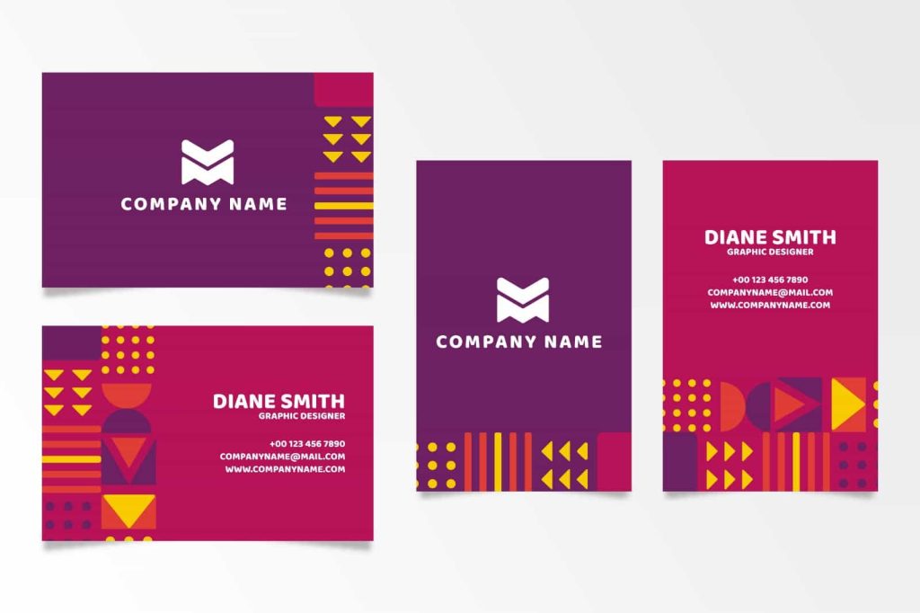
That is where the majority of small businesses go wrong. They create a good brand identity and then execute it randomly. The business card uses one version of the logo. The flyer uses a different shade of the brand colour. The Instagram page looks nothing like the packaging.
All the customers’ touchpoints should appear as a part of the same family. Your business card, your packaging, your flyers, your social media profiles, your email signature, as well as your storefront should feel like it is from the same business.
There’s no such thing as coincidence in consistency. It’s because you have a system and you follow it each and every time.
Final Word
It does not require much budget to build a brand identity from scratch. It is simply about clarity in decision making and using this decision consistently over time.
Explain your business’s “mission statement”. Be careful when picking your name. Create an effective logo. Develop a colour palette that conveys the appropriate mood. Use fonts that can be easily read and that are uniform. Create a voice that’s you. Document in a style guide. Then use it in everything your business involves.
If you do all this, your business will certainly look and feel more professional than others, which have been around a lot longer and have invested much more money into the business.
Do you have a brand identity for your business? If you have any questions, leave them in the comments and I’ll help you out with them.