
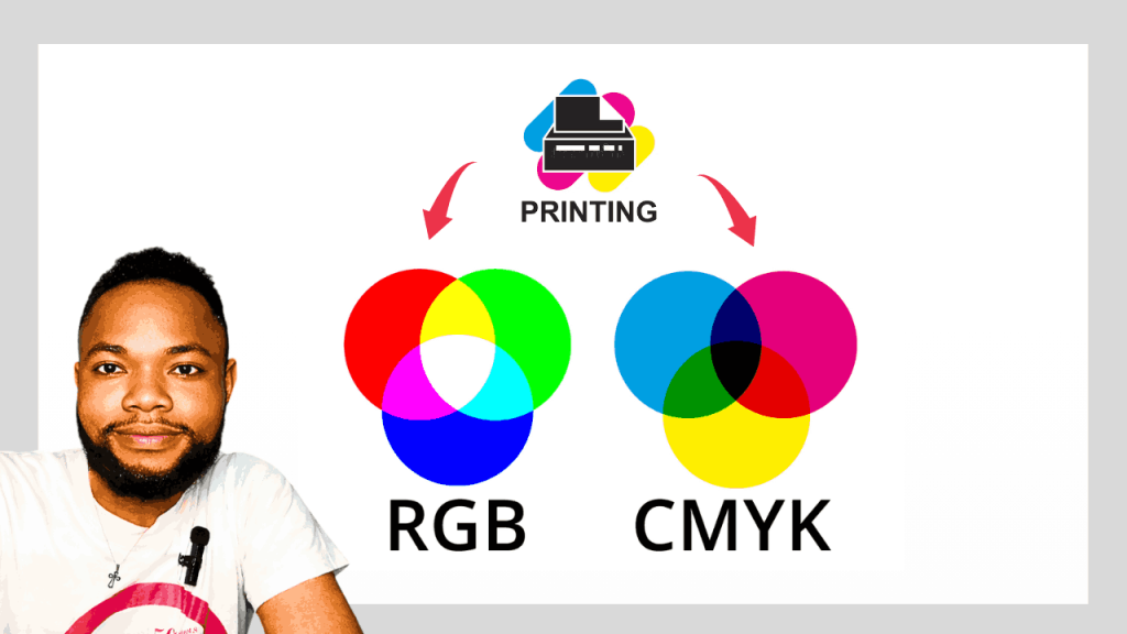
When printing your design, you need to understand the difference between CMYK and RGB. As a designer, it’s important to understand the difference before you send your design to print.
You may see something really cool on the screen, but it won’t work on paper.
Not because the layout is bad. Not because the typography requires attention. Not because the printer made an error.

Color is the most common problem.
Every designer who spends enough time around print eventually experiences that moment. The file is great when it’s in the approval process. The colors are rich. The client is really happy. After that, the printed version arrives, and it feels different. The bright blue doesn’t pop. The rich green is dull. The overall energy level of the piece is somewhat dampened compared to what was seen on screen.
The downside is that there’s no apparent technical cause. The correct file was used by the printer. All dimensions are correct. Images are crisp and clear. But the outcome is still somewhat different.
Knowing how this can occur is where designers differ. Some hope their print jobs will look good. Others can foresee how the final result will look before production starts.
Many people don’t realize this, but RGB and CMYK simply aren’t interchangeable.
Why Doesn’t Your Printed Design Look Exactly Like Your Screen?
It’s easy to see that most people spend way more time viewing a screen than they spend reading printed materials, and it’s easy to assume that what is on a screen is the real thing.
It isn’t.
Your monitor is a light source. All of the colors you see are based on the direct illumination of light into your eyes. Paper works differently. It has no light of its own. It is totally dependent on light reflected from the surrounding environment.
That’s a difference that makes all the difference.
A bright social media graphic viewed on a phone at peak brightness has advantages that a printed flyer cannot match. The screen can produce glowing colors, high contrast, and vibrant effects due to its control of the light. Paper cannot compete in the same manner because it depends on external lighting conditions.
Consider a movie theater screen and a painted wall. They can both show an image, but they do so completely differently. Don’t expect them to give you the same results.
The same holds for print design. It’s not about turning paper into a monitor. The purpose is to produce the best possible printed version of the design.
Why Do Colors Shift After Printing?
Designers often talk about color shifts when discussing software settings or printer settings. Those things are important, but they’re not the root cause.
The problem is that screens and printers use different color languages.
A screen creates color using light. A printer creates color using ink. The systems overlap, but they are not the same. Some colors can be rendered easily on a monitor but cannot be reproduced accurately by a printer using standard printing inks.
Think of a sunset and trying to represent it with only four crayons. It is possible to come close, but you cannot capture all the subtle shades. The challenge for printing is similar. The printer is limited in the colors that can be used, so some RGB colors need to be converted to the closest match possible.
This is the part where there are many surprises.
Many designers believe that the printer has altered the color. In fact, it wasn’t even a color that could be printed in the first place.
RGB Was Built for Screens. CMYK Was Built for Paper
RGB is a term for Red, Green, and Blue. These are the basic light colors utilized by digital displays. RGB is used in every website, social media graphic, YouTube thumbnail, streaming platform, and mobile application because images on a screen are always created with emitted light.
CMYK stands for Cyan, Magenta, Yellow, and Black. It was developed specifically for printing because printers create images using physical inks instead of light.
The distinction is technical in nature, but it has real-world implications.
When designing for Instagram, a website, a mobile app, or even an email campaign, RGB provides more colors and greater vibrancy.
If your design will be used in a brochure, banner, flyer, magazine, notebook cover, product label, or business card, your design will ultimately exist in the CMYK environment.
This is where many designers get into trouble. They spend hours working with colors in an RGB environment, get attached to colors that only exist on a screen, and then realize that these colors aren’t print-friendly.
The sooner the decision is made about where the design will be displayed, the easier all the other production decisions become.
The Colors Your Monitor Can Show That Your Printer Can’t
Launch a design program and crank up the saturation. Increase the vibrancy. Try some brilliant blues, shimmering greens, and neon pinks.
Most screens display those colors well.
Now think about printing them.
That’s where the concept of color gamut comes in. The term color gamut is simply used to indicate the range of colors that a system is able to reproduce. RGB has a much larger color gamut than CMYK. This means that there are colors you can see on your computer screen that cannot be reproduced through standard commercial printing methods.
This is a common issue that designers face when creating event flyers, nightlife promotions, gaming graphics, cosmetic packaging, and youth-focused brands where bright colors are a major feature.
Those colors are exciting on a monitor because they can be created using light. A printing press needs to use physical pigments. At some point, the printer reaches its limit.
If that occurs, the software is forced to shift the color back into the printable range. The final product can still look good, but it’s likely that it won’t be as intense as the original version seen on-screen.
But that’s not the printer’s fault.
It’s a limitation of physics.
The Most Expensive Mistake Designers Make Before Printing
The most costly print error typically does not occur at the start of a project. It usually occurs at the end.
The designer creates a brochure, package design, or flyer in RGB. The client approves everything. The team involved in the design process celebrates. Then someone remembers that the file has to be sent to print.
The following is a rapid color conversion from RGB to CMYK.
All of a sudden, the colors change.
Now the designer has a tough decision to make. Accept the new colors or spend additional time reworking the design. When the project incorporates brand colors, product packaging, or corporate materials, both options seem unappealing.
With large print volumes, this mistake becomes even more expensive. A color problem affecting 50 flyers is frustrating. Twenty thousand product labels with color issues is a serious business problem.
Experienced print designers never have to deal with this situation. They decide on the final destination before they start designing. If the piece will be printed, they begin working in CMYK. This means every color choice is made within realistic production limitations.
When the final result is no longer a surprise, the entire design process becomes more predictable.
Why Brand Colors Don’t Always Print Correctly
Color is among the most effective branding tools a business can use.
Brands are often recognized before company names are read. Some colors become strongly associated with certain businesses, products, and experiences. Through the years, these colors have become part of the brand’s identity.
This is why consistency in color matters.
If your logo appears one way online and another way in print, it creates friction. It’s not something that most people will consciously notice, but it is definitely something they will feel.
The challenge becomes even greater when a brand is active across several platforms. The same logo can appear on a website, business card, product packaging, trade show banner, vehicle branding, and promotional merchandise.
Color behaves differently depending on the environment.
Professional brands solve this by developing detailed brand guidelines that contain both digital and print color specifications. They realize that RGB colors used for screens do not automatically translate to print in the same way.
Consistency is not random.
It is managed.
Black Isn’t Always Black in Print
Many designers discover rich black after receiving a print job that doesn’t look as good as expected.
On-screen, black is easy. Pick a black color, apply it, and move on. Black becomes more complex in print.
A standard CMYK black is created using only black ink. This works fine for small text. Problems start when large areas of black are used. A black background that looked deep and dramatic on-screen may appear dull or slightly gray in print.
This is why rich black is commonly used by professional designers.
Rich black is made up of black ink and controlled amounts of cyan, magenta, and yellow. The extra inks create a level of depth and density that standard black can’t provide.
But rich black isn’t always a sure bet. Values may vary depending on the printing method, substrate, or production environment. A rich black that works well on coated paper may not work the same way on uncoated paper.
Smart designers don’t guess.
They check the specifications with the printer before production begins.
The Print-Ready Checklist Professional Designers Use
Professional printing isn’t just about software. It’s about discipline.
Professional designers don’t consider it good practice to send files to the printer immediately after finishing them. They look at the project from a production point of view rather than a creative one.
At this stage, the question is no longer, “Does the design look good?”
The question becomes, “Will this file make it through production without issues?”
Dimensions are checked. Images are reviewed. Fonts are verified. Color settings are checked. Bleed areas are confirmed. Contact information is double-checked.
Most printing mishaps happen because of small oversights rather than major design flaws. A missing bleed setting. A low-resolution image. An incorrect color profile.
The best designers are the ones who detect those issues before the file ever reaches the printer.
Step-by-Step Guide to Preparing a Print-Ready File
Step 1: Validate the Printer’s Requirements
Each print service provider has its own specifications. Some require special PDF settings. Others use different export settings or bleed requirements. Having those requirements early means there is no guesswork later.
Step 2: Set Up the Document at Final Size
Creating a design at random dimensions and resizing it later increases the chances of problems. Begin with the final production size from the start.
Step 3: Work in CMYK From the Beginning
This is one of the simplest methods to prevent color surprises. Designing in the same environment used for printing reduces the number of unexpected results during production.
Step 4: Use High-Resolution Images
High-definition images can still become blurry when printed if they are not suitable for print. Printing requires more detail. Once on paper, image quality issues become obvious.
Step 5: Add Proper Bleed
Printing presses are accurate, but they’re not infallible. Very slight cutting variations occur during production. Bleed is required to protect your design from those changes. Extending backgrounds and images beyond the trim area helps ensure clean edges after cutting.
Step 6: Ensure Critical Content Is Protected by Safe Margins
Text that sits too close to the edge creates risk. Important details like logos, phone numbers, and essential information should remain safely within the trim area.
Step 7: Review Colors Carefully
Be mindful of bright colors, gradients, and branding elements. These are typically the most sensitive areas when printing.
Step 8: Handle Fonts Correctly
Missing fonts can completely alter a layout. Embedding fonts or converting them to outlines ensures the printer sees exactly what you created.
Step 9: Export Using Print Settings
Do not rely on default export settings. Follow the printer’s instructions and check all production parameters before exporting the final file.
Step 10: Double-Check Everything Before Submission
Some errors can only be discovered during a final review. Spelling mistakes, incorrect contact information, missing elements, and production setting issues are far easier to correct before printing than afterward.
Why Professional Printers Still Request Proofs
Design software continues to improve. Printers improve all the time. However, proofs are still a vital part of serious print production.
There’s a reason for that.
No monitor can be 100% accurate in reproducing the behavior of ink on a particular type of paper under specific lighting conditions. Coated paper behaves differently from uncoated paper. Matte finishes are not the same as glossy finishes.
When a proof is presented, uncertainty disappears.
You don’t have to guess what the final product will look like. You can see it.
For large print runs, packaging projects, catalogs, magazines, and premium marketing materials, a proof can save you from expensive surprises. It remains one of the simplest forms of insurance available in print production.
Print Problems That Have Nothing to Do With Design Skill
Not all print problems are caused by poor design.
Many issues are related to workflow habits.
Designers trust monitor brightness too much. They download stock graphics without considering color profiles. They assume all printers will produce the same results. They ignore production requirements because the design appears perfect on the screen.
None of those problems has anything to do with creativity.
They involve a process.
The strongest print designers are not always the people who create the flashiest layouts. They are the ones who understand how design decisions connect to production realities.
This knowledge saves time, protects budgets, and produces more consistent results.
The One Rule That Eliminates Most Print Color Mistakes
If people will be viewing the design on a screen, use RGB.
If people will be holding the design in their hands, use CMYK.
Simple.
That one decision prevents a surprising number of production problems. It keeps color choices realistic, streamlines file preparation, and reduces last-minute surprises during printing.
The more print projects you complete, the more natural this rule becomes.
Eventually, choosing the correct color mode becomes just as natural as selecting the correct document size. You stop thinking of it as a technical setting and start treating it as a core part of the design process itself.
Before You Click “Send to Print”
Color problems should not be discovered for the first time at the printer.
Once a file reaches the production stage, the important decisions should already have been made. Color mode. Resolution. Bleed. Brand consistency. Print settings. All of it.
That’s what separates a predictable print result from an expensive surprise.
The designers who consistently produce excellent print work are not taking shots in the dark. They understand how color behaves before it ever reaches paper. Once you understand the relationship between RGB and CMYK, you stop hoping the print job will turn out right.
You already know what it will look like.